
FIRE & ICE REBRAND
PROJECT DESCRIPTION
For this project, I chose a local business here in Hot Springs, Arkansas, and rebranded all of the advertising and marketing materials including a new logo, print materials, and merchandise products.

NEW LOGO

OLD LOGO
RESEARCH & DEVELOPMENT
Brand Strategies
To rebrand my business of choice, Fire & Ice Sweets, I had to do some investigative research and get on-site to see what the business was like already.
Target Audience
The target audience for Fire & Ice Sweets is geared towards young families that want to take a trip to the Hot Springs Mall for a fun outing with their children.
PROCESS WORK
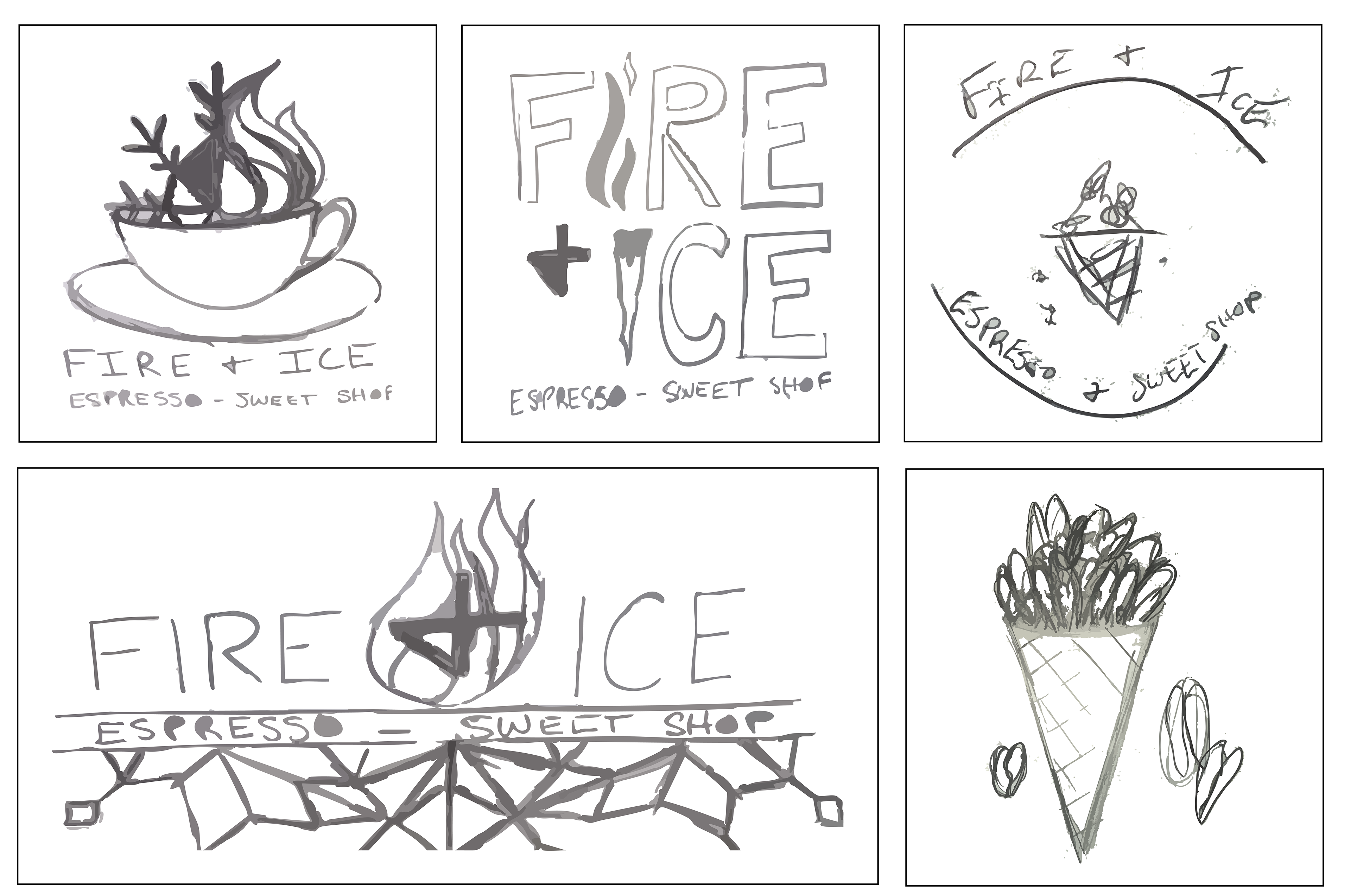
Sketches
Typography
I chose Neutra Text as my font for this project because it is bold and legible. It can be read from close distances as well as far distances. For my body font, I went with Calibri with a regular style. This font choice was perfect because it does not distract from the main logo, but it is legible.

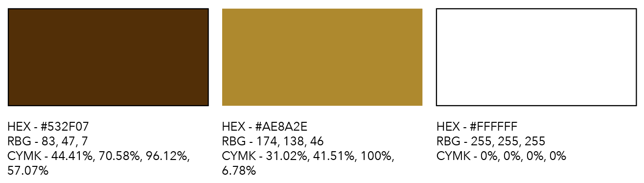
Color Palette
I wanted the colors in my logo to depict the feeling of both coffee and ice cream. The brown color is suited for both a chocolate ice cream and dark coffee color. The light brown color serves to resemble a caramel topping or caramel ice cream and a caramel mocha look and feel.
FIRST ITERATIONS

Design Decisions
For my first iteration, I wanted to depict the concept of fire and ice together. This was inspired by the original logo. I felt that I could keep this concept but create a logo that felt more like coffee and ice cream.
SECOND ITERATIONS
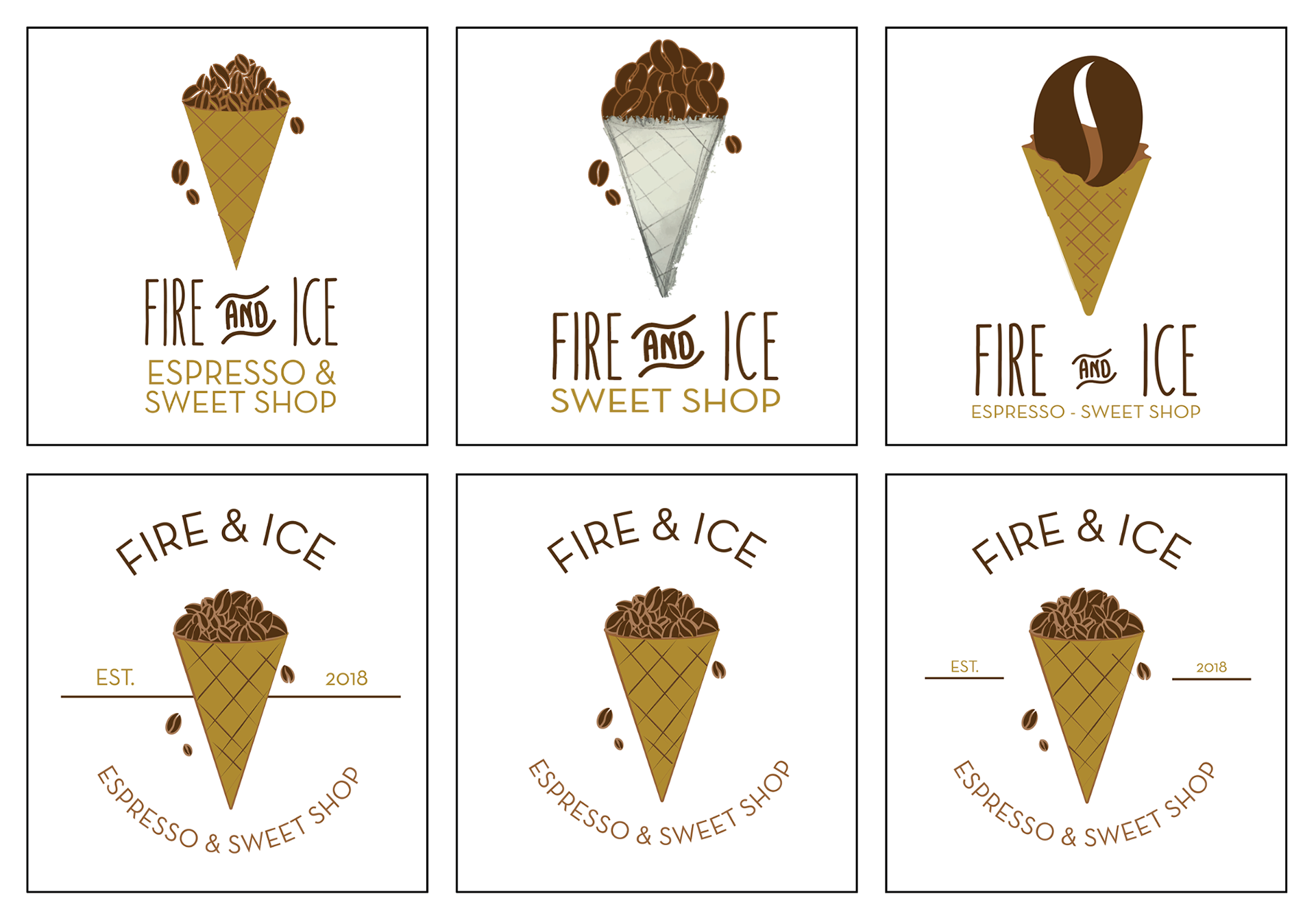
Design Decisions
After much consideration, I decided that combining the two concepts was not the best depiction of the business. Instead, I chose to keep the logo more simple so that customers could better understand what products the business sells.
FINAL DESIGNS
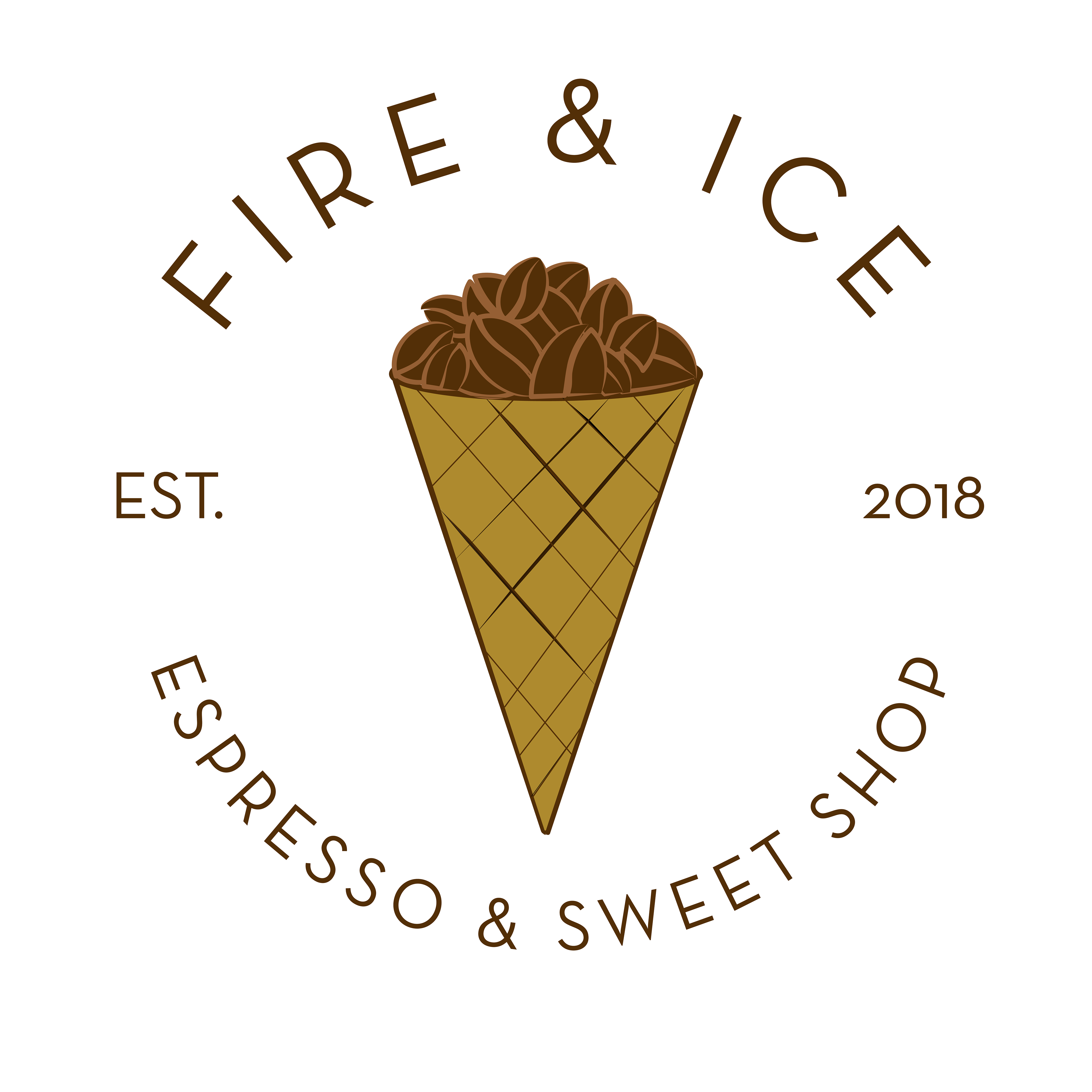
Color

Black & White
ENVIRONMENTAL CONTACT
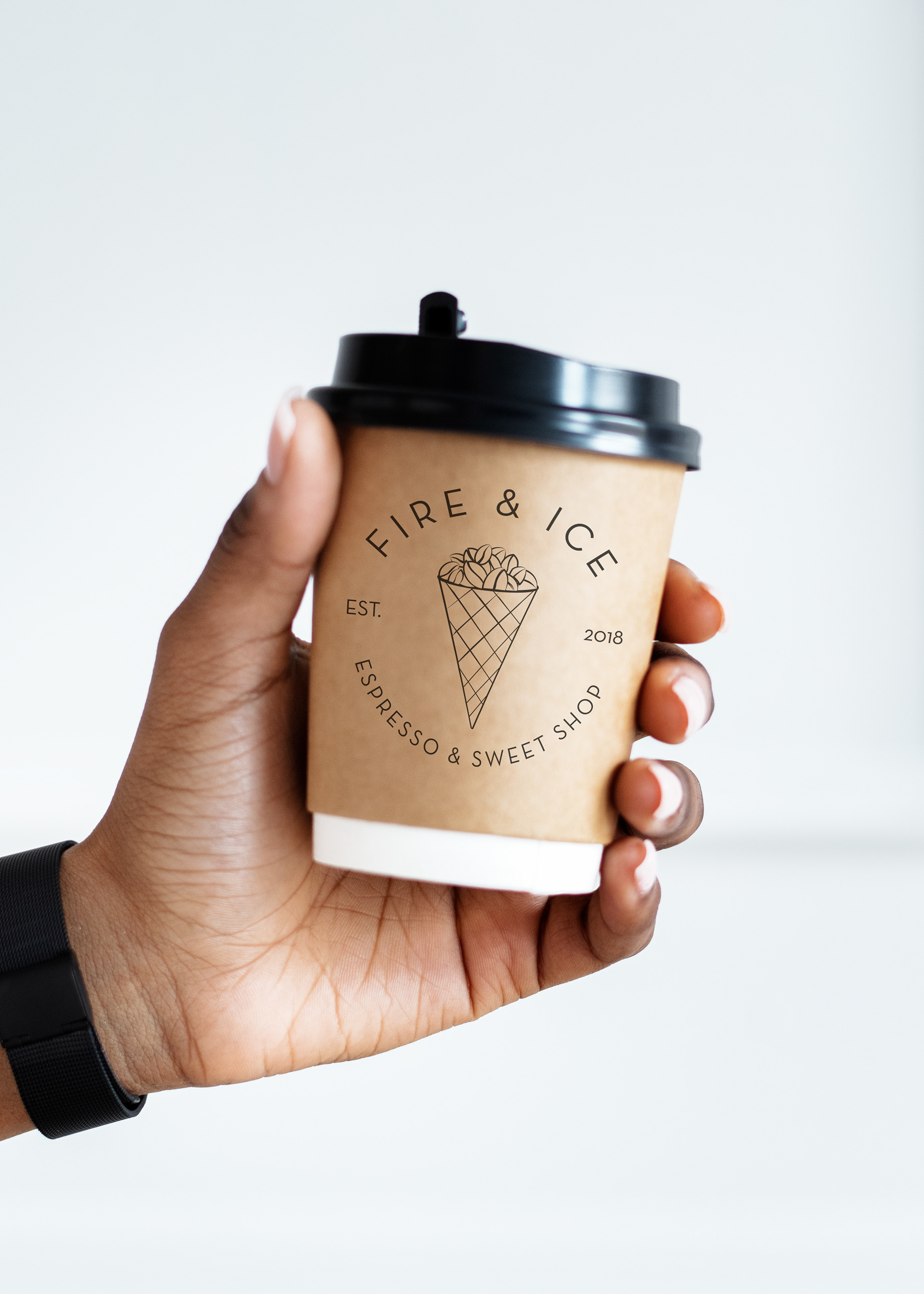
Coffee Cup
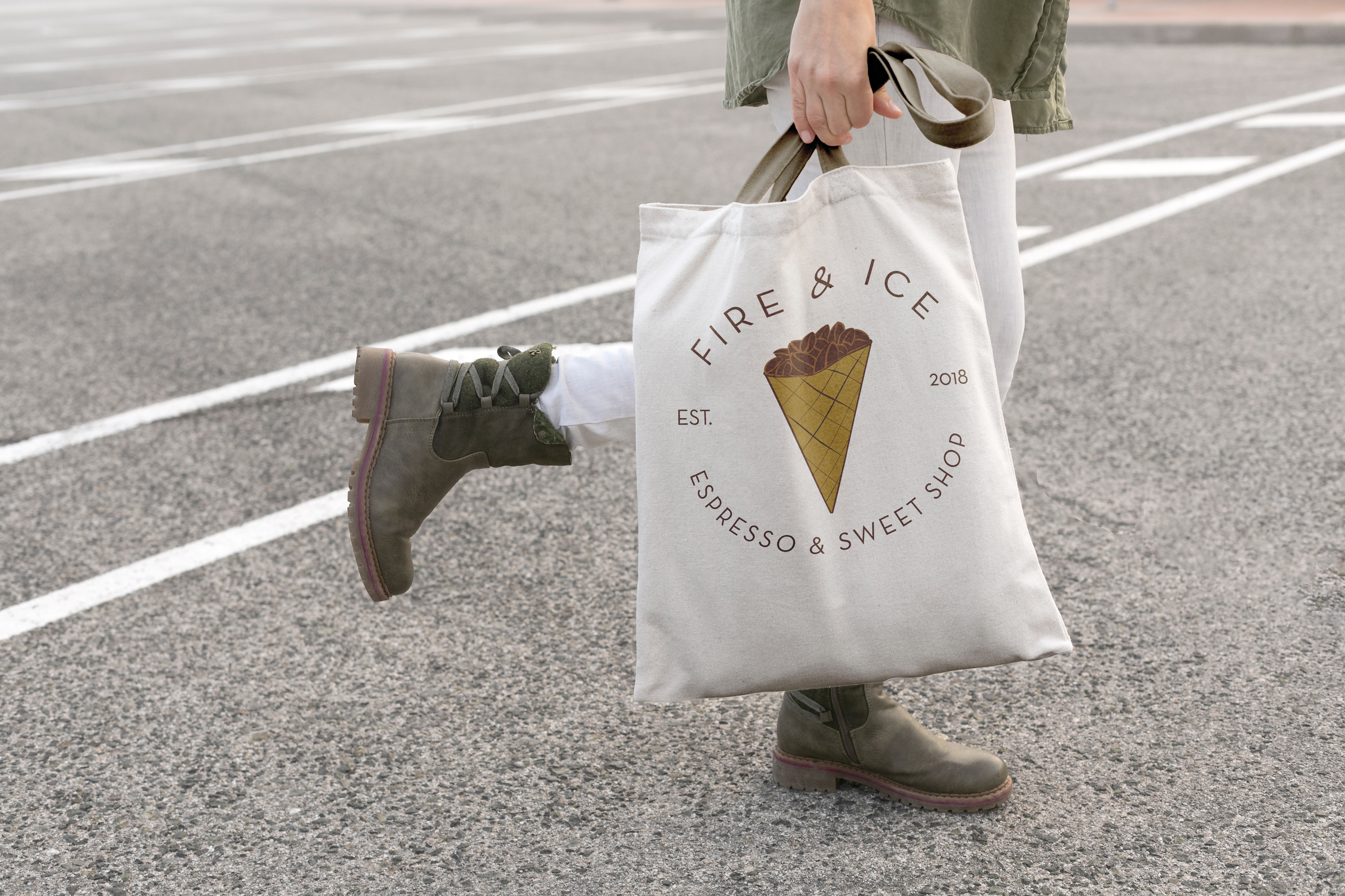
Tote Bag

Hat
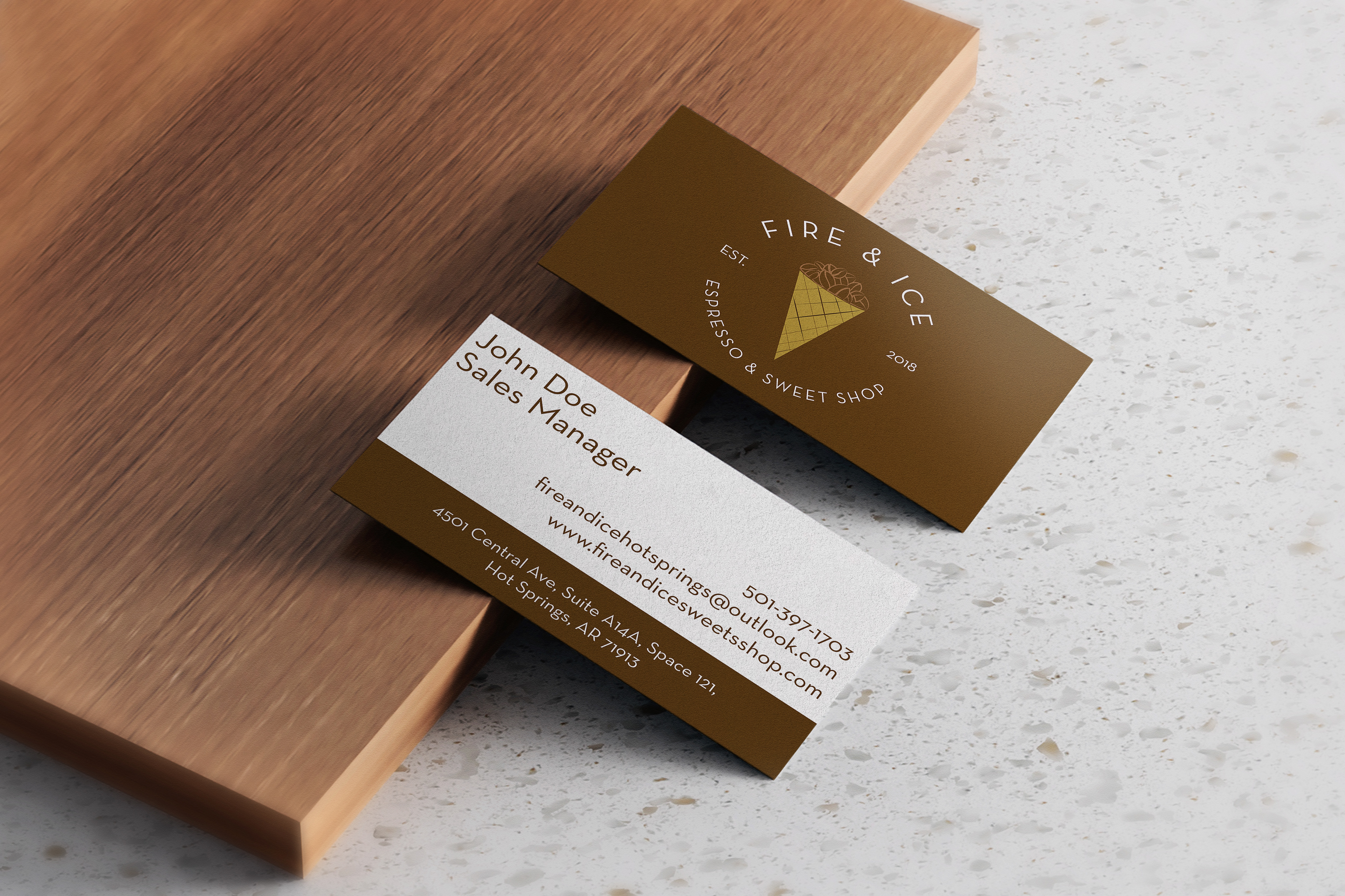
Business Card

Coffee Cup